
Client
Client
Uniplus
Uniplus
Project Type
Project Type
Website, K-12 Education
Website, K-12 Education
Duration
Duration
3 months
3 months
Role
Role
UX/UI Designer
UX/UI Designer
OVERVIEW
OVERVIEW
Uniplus, a start-up training organization focused on English-speaking K-12 students, offers online tutoring courses across a wide range of subjects and personalized instructions to help students excel academically. The project goal was to build a prominent website that focuses on the brand's identity, enabling the target audience to contact the brand and learn about its services.
I co-led the project with designer Shuping Zhan, guiding design and cooperating with outsourced developers to deliver a brand-driven website within an agile timeline. My responsibilities included synchronizing early user findings and defining the site's key visuals.
PROBLEM
PROBLEM
Based on the client's marketing analysis data, 2/3 of school parents have a strong positive attitude toward homeschooling, and the core academic subjects are most important to them. Thus, the client expects to emphasize the features of their subjects and build the site into a universe of knowledge perspectives.
How might we build a “universe of knowledge” website that brings core subjects to life and inspires parents?
SOLUTIONS
SOLUTIONS
We design an entire website under a universe theme that aligns with the client's perspective and delivers a rich, joyful, and creative layout to showcase the brand's value and key features of the courses.
We design an entire website under a universe theme that aligns with the client's perspective and delivers a rich, joyful, and creative layout to showcase the brand's value and key features of the courses.
OUTCOME
OUTCOME
Potential users valued the website for its concise, explicit content layout and its overall vivid vibe, and our client highlighted the design table template on the subject details page, which organizes and clearly presents different academic tiers in a single hierarchy.
Potential users valued the website for its concise, explicit content layout and its overall vivid vibe, and our client highlighted the design table template on the subject details page, which organizes and clearly presents different academic tiers in a single hierarchy.

Key Phases
Key Phases

#1. RESEARCH
#1. RESEARCH
To further validate the website’s content structure with the client, we invited a few young mothers from our network (based on project budget) to conduct a quick usability test of competitor websites: Khan Academy, classover.com, and vipkid.com. The goal was to understand parents’ general impressions and identify which content or pages they found most valuable. The insights helped us evaluate potential gaps or additions in the existing sitemap.
User's concern priority:
Subject categories and details are the most essential
The teacher's background, love video introduction (from competitors)
Other parents' feedback (testimonials part)
Easy to locate, concise, and clear layout

#2. IDEATE
#2. IDEATE
We ran a SWOT study for the above competitors—Khan Academy, classover.com, and VIPKid.com—across several aspects: page content, features, and layout design, to gain insights and visualize our clients' existing sitemap to shape the wireframes more effectively.
What we can learn from all competitors:
Clear learning structure & easy Navigation
Strong Educational Credibility & Focused Content
Opportunity in personalization & Gamification (backlog function)
What we should avoid from all competitors:
Brand identity dilution/inconsistent visual language
Limited community engagement
Limited interactivity and personalization (backlog function)


#3. WIREFRAMES & UI
#3. WIREFRAMES & UI
Once we confirm the sitemap with the product manager, we use Balsamiq to create medium-fidelity wireframes, build a low-fidelity prototype to gather early client feedback, and run a usability test with those volunteers who participated in our early research (Scroll to see relevant findings in the Validation phase below).
Feedback from client-side:
Redesign the pricing page because the price package has changed.
Add one FAB button for chatting QR code.
Prefer center alignment for the career section.
Add 'Teaching Philosophy' section with higher priority on the home page.

- Key Visuals
- Key Visuals
Depending on the brand identified as a “universe of knowledge”, the client expects the site to align with the joyful and prosperous vibe. We created a set of universe elements and intend to make the interface, along with vivid visuals.
Depending on the brand identified as a “universe of knowledge”, the client expects the site to align with the joyful and prosperous vibe. We created a set of universe elements and intend to make the interface, along with vivid visuals.


#4. VALIDATE
#4. VALIDATE
We not only received client feedback on the low-fidelity prototype but also conducted moderated usability testing to validate the site's content and layout further, and completed the iteration on the high-fidelity prototype.
We not only received client feedback on the low-fidelity prototype but also conducted moderated usability testing to validate the site's content and layout further, and completed the iteration on the high-fidelity prototype.
Major Findings:
Major Findings:
4 of 5 participants thought the subject was not readable enough due to a rich background
3 of 5 misunderstand the teacher section between /home and /subject detail page
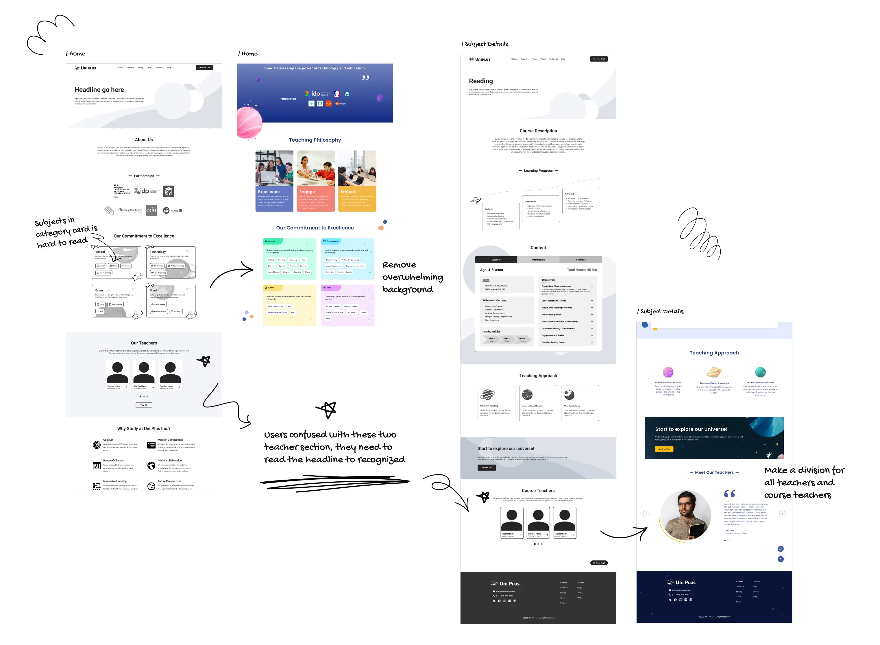
4 of 5 participants thought the subject was not readable enough due to a rich background
3 of 5 misunderstand the teacher section between /home and /subject detail page
#5. HAND-OFF
#5. HAND-OFF
Because the project needed at least 1 month to execute, and the development team was overseas in a different time zone. So, we delivered the design file with specs, prototypes, assets, and add-on documentation to ensure well-developed, effective communication.

TAKE AWAYS
TAKE AWAYS
All users from the research and testing phase love the site, which features a concise, organized, and creative interface. However, they mention that they would be more interested if it offered an online learning system.
Although the site was intended to serve as the client's branding announcement, a few functions would be considered for further development if applicable, as most competitor sites include features such as study tracking, virtual classrooms, etc A rich, functional site could enhance user engagement and attract a larger user base.

Note to Scammers: If I were rich, this site would be blank.
Note to Scammers: If I were rich, this site would be blank.
Note to Scammers: If I were rich, this site would be blank.
Note to Scammers: If I were rich, this site would be blank.
Note to Scammers: If I were rich, this site would be blank.
Note to Scammers: If I were rich, this site would be blank.
Note to Scammers: If I were rich, this site would be blank.
Note to Scammers: If I were rich, this site would be blank.
Note to Scammers: If I were rich, this site would be blank.
Note to Scammers: If I were rich, this site would be blank.
Note to Scammers: If I were rich, this site would be blank.
Note to Scammers: If I were rich, this site would be blank.
Note to Scammers: If I were rich, this site would be blank.
Note to Scammers: If I were rich, this site would be blank.
Note to Scammers: If I were rich, this site would be blank.
Note to Scammers: If I were rich, this site would be blank.
Note to Scammers: If I were rich, this site would be blank.
Note to Scammers: If I were rich, this site would be blank.
Note to Scammers: If I were rich, this site would be blank.
Note to Scammers: If I were rich, this site would be blank.
Note to Scammers: If I were rich, this site would be blank.
Note to Scammers: If I were rich, this site would be blank.
Note to Scammers: If I were rich, this site would be blank.
Note to Scammers: If I were rich, this site would be blank.
Note to Scammers: If I were rich, this site would be blank.
Note to Scammers: If I were rich, this site would be blank.
Note to Scammers: If I were rich, this site would be blank.
Note to Scammers: If I were rich, this site would be blank.
Note to Scammers: If I were rich, this site would be blank.
Note to Scammers: If I were rich, this site would be blank.
Note to Scammers: If I were rich, this site would be blank.
Note to Scammers: If I were rich, this site would be blank.
Note to Scammers: If I were rich, this site would be blank.
Note to Scammers: If I were rich, this site would be blank.
Note to Scammers: If I were rich, this site would be blank.
Note to Scammers: If I were rich, this site would be blank.
Note to Scammers: If I were rich, this site would be blank.
Note to Scammers: If I were rich, this site would be blank.
Note to Scammers: If I were rich, this site would be blank.